PUBLISHING | MAGAZINE
Focus Junior
project
Magazine project
Art Direction
Layout
Infographics
client
Mondadori Scienza
years
2016-2018
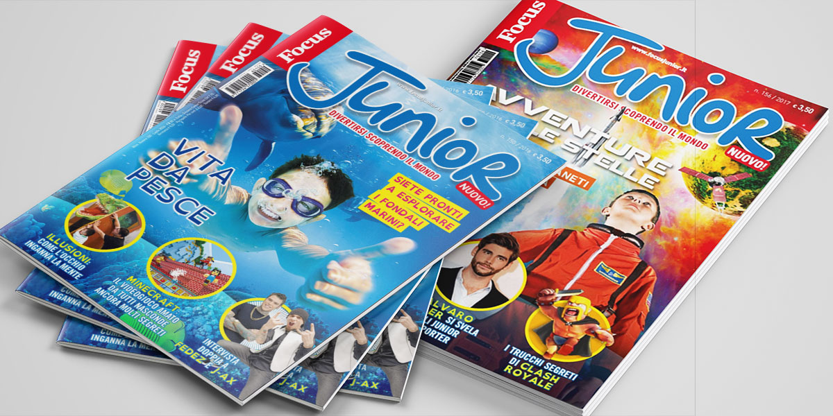
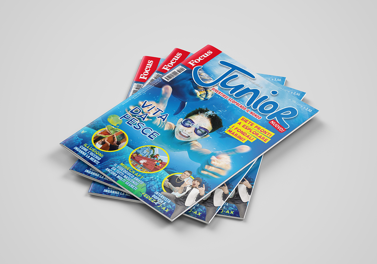
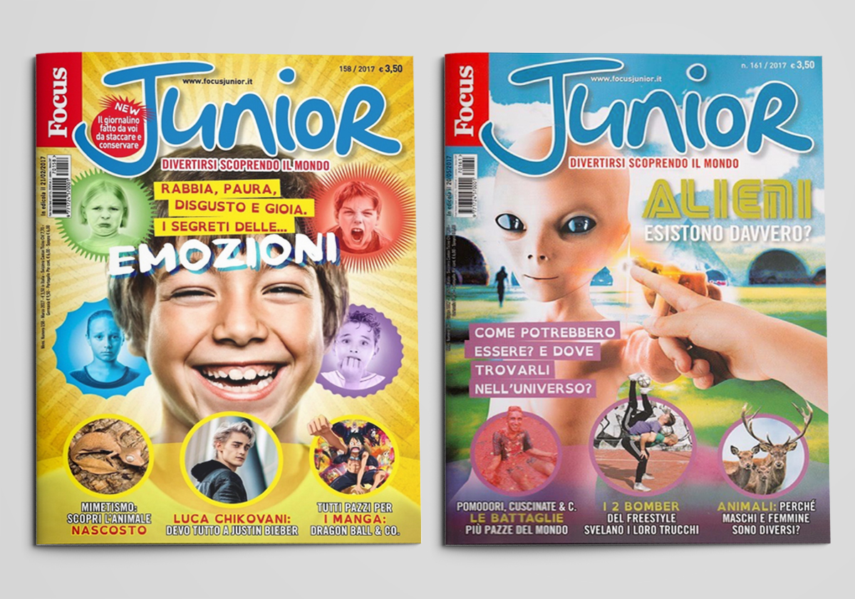
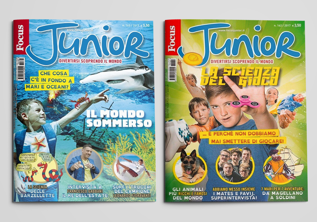
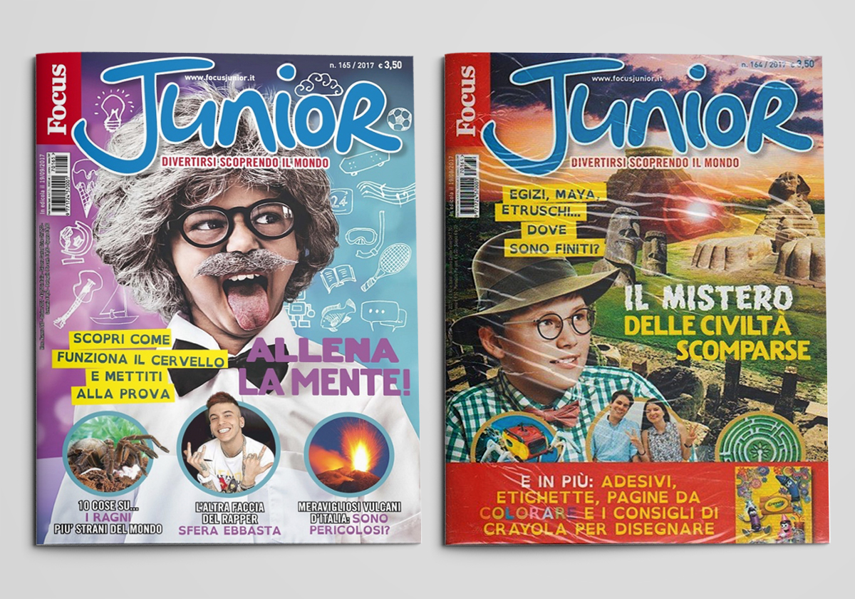
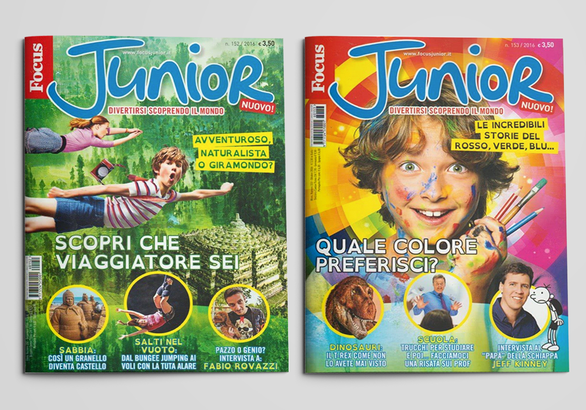
The project wanted to keep the content happy through the colors and facets of the information, adapting it to all readers, from the youngest, interested in large numbers and short and targeted things, to teenagers who read more and are interested in deepening the information.
The project aims to make everyone read as much as possible, modifying the most drawn reading font with letters with a very marked sign and introducing a font designed specifically for dyslexics.
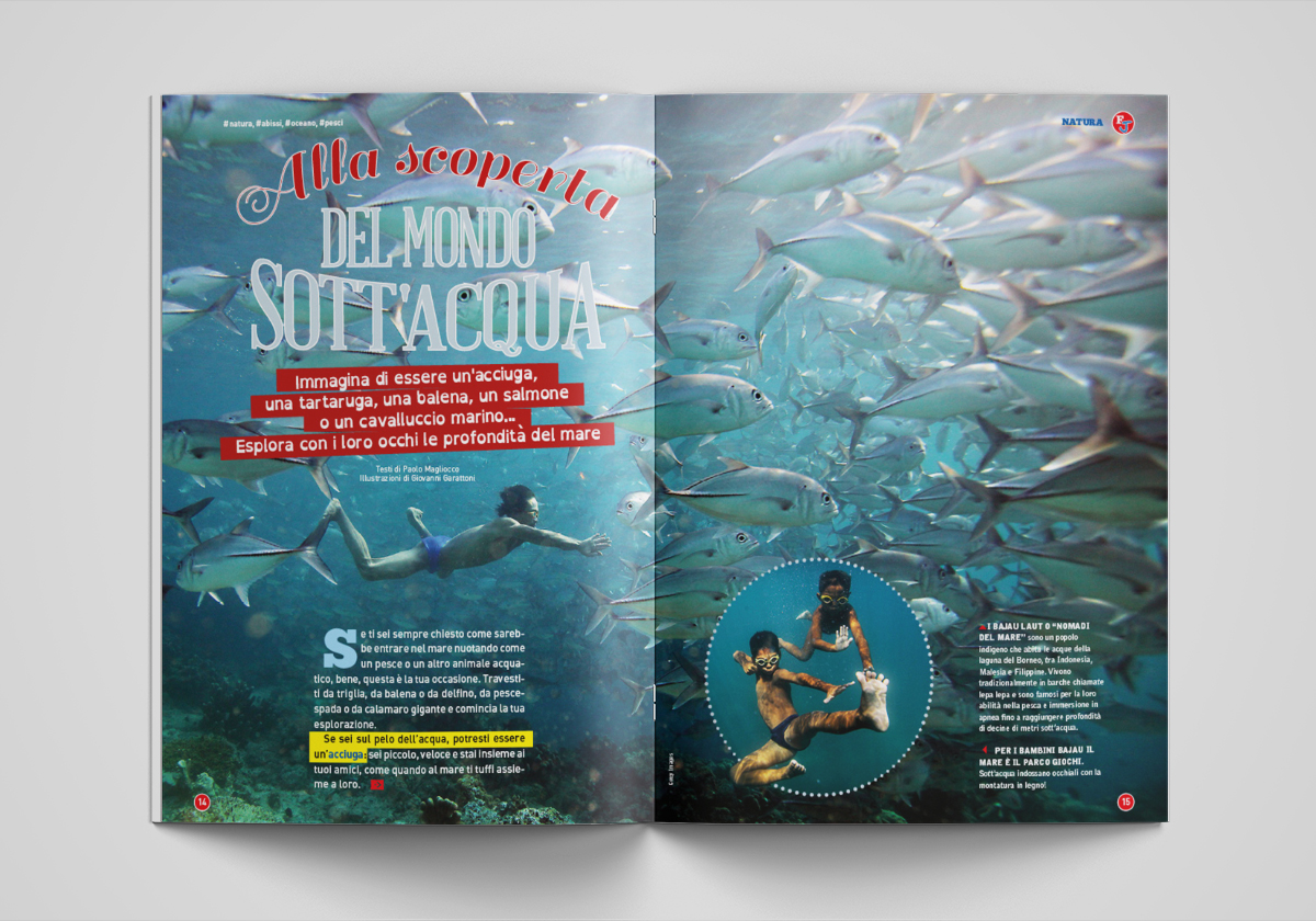
Some of the columns of the magazine that previously presented as crowded double pages, are now scattered inside the articles that act as boxes for the deepening and provide the right alchemy that readers like even by providing a block reading in addition to the normal flow of the main text.
More order, more cleanliness, which have been highly appreciated in the focus groups, together with very bright colors and a restoration of the "geometry" and order of the sense of reading, different sockets and visual signals for the reader's eye eager to learn and know .
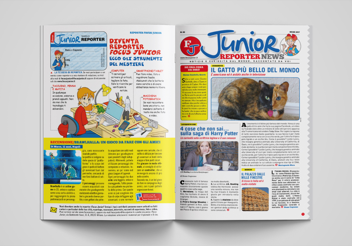
Tabloid with User-generated content (monthly insert)